Tuesday 22 December 2009

Immersion in history - 1

One obvious aspect of chronographics is that they are designed to provide overview or perspective – to produce an objectivising effect. Priestley wrote:
TIME is continually suggested to us, by the view of this chart, under the idea of a river, flowing uniformly on, without beginning or end. [...] IF we compare the lives of men with that portion of it which this chart represents, they are little more than so many small straws swimming on the surface of this immense river, strongly expressing the admirable propriety of those lines of Dr. Watts, concerning the eternity of GOD.
While, like a tide, our minutes flow,
The present and the past ;
HE fills his own eternal NOW.
And sees our ages waste.
Priestley, Joseph. 1764. Description of a Chart of Biography. J. Johnson, London. p26.

A less obvious potentiality is to create a sense of immersion in the moment. Priestley described it like this:
IT is a peculiar kind of pleasure we receive, from such a view as this chart exhibits, of a great man, such as Sir Isaac Newton, seated, as it were, in the circle of his friends and illustrious cotemporaries. We see at once with whom he was capable of holding conversation, and in a manner (from the distinct view of their respective ages) upon what terms they might converse.
Op cit. p24.

This is one of the strongest features of the Machine Chronographique of Barbeu-Dubourg. He writes of his invention as...
...a moving, living tableau, through which pass in review all the ages of the world, where each famous figure steps forth in his rank with the attributes belonging to him, where each Prince is surrounded by his contemporaries and occupies the scene for more or less time according to the duration of his role, where the rise and fall of Empires are acted out in visible form...
Barbeu-Dubourg, Jacques. 1753. Chronographie, ou description des temps…. Paris. Photocopy in the Rare Books Collection, Princeton University Library, from an original of the explanatory booklet for the chart (q.v.) in the Bibliothèque Nationale, Paris. Princeton University Library call number: D11 .B372 1753a. p8
And again...
Do you wish to look next through the entire Chart? First you find God alone before all time; then you see Adam appear, and at once the sequence of the centuries, in which all the years are marked out...
Op cit. p13

Here the sense of history as immersive experience is uppermost. More on this in future posts.

Representing uncertainty

One of the weaknesses of most chronographics is that they conceal uncertainty. This was the case with the first modern timeline, the Carte Chronographique of Barbeu-Dubourg, but not the second, Priestley’s Chart of Biography. Priestley wrote:
It is an imperfection which must necessarily attend every chart of this nature, that the time of the death but more especially the time of the birth of eminent men cannot always be found. In this case the compiler must content himself with placing his line as near as he can conjecture from history where his true place was, leaving marks to express the uncertainty there is attending it.
Priestley, Joseph. 1764. Description of a Chart of Biography. J. Johnson, London. p11.
Priestley’s references to uncertainty can be seen in the copy of his Description on Google Books.

It is increasingly recognised that visualisations need to represent uncertainty effectively. 
Scientific data from instruments, numerical models, or interpolation schemes almost invariably contain some degree of error or uncertainty. Display of such scientific data without uncertainty information is incomplete and may lead to erroneous conclusions. Visualization of data with uncertainty information allows more accurate and effective interpretation.
Wittenbrink, C.M., Pang, A.T. and Lodha, S.K. 1996. Glyphs for Visualizing Uncertainty in Vector Fields. IEEE Transactions on Visualization and Computer Graphics 2(3). September 1996.


Priestley, Joseph. 1765. A Chart of Biography. Photo: Stephen Boyd Davis. With the permission of Chetham's Library, Manchester. 
Priestley not only recognised the problem but devised an effective solution within the limits of the available technology. Minor uncertainty is expressed by a dot underneath the end of the lifeline in question. Increasing levels of uncertainty are expressed by replacing the end of the lifeline with between one and three dots. The illustration above includes three examples which are all dots.

Based on a classification of forms of uncertainty suggested by Pham, Streit and Brown (2009), I have itemised some of the uncertainties that might need to be represented in a timeline for today:
  • Range of precision: might range from centuries to seconds.
  • Dates which are unknown
  • Dates which are uncertain with various levels of uncertainty.
  • Dates of inherently fuzzy events such as movements, trends, ‘-isms’ etc.
  • Multiple sources: conflicting evidence of dates
  • Multiple models: conflicting calendars (Julian, Gregorian, Islamic, Jewish, Buddhist etc).
  • Membership of sets prone to views of different experts. Dispute over categories.
  • Sets worthy of modelling contested (Priestley acknowledged that his set is dominated by the English and that it would have been different if designed for a different public).
  • Need to be able to import existing datasets which may be inadequate in many, perhaps unpredictable, ways.
References
  • Pham, B., Streit, A. and Brown, R. Visualisation of Information Uncertainty: Progress and Challenges. In: Zudilova-Seinstra, E., Adriaansen, T. and van Liere, R. (eds.) Trends in Interactive Visualization. Springer, London. 2009. 19-48 
  • Priestley, Joseph. 1764. Description of a Chart of Biography. J. Johnson, London. 
  • Wittenbrink, C.M., Pang, A.T. and Lodha, S.K. 1996. Glyphs for Visualizing Uncertainty in Vector Fields. IEEE Transactions on Visualization and Computer Graphics 2(3). September 1996.

Monday 21 December 2009

Lorenzo da Ponte, ungleichzeitigkeit, chronographics

Some possible translations of the German ungleichzeitigkeit include:
    not-happening-synchronously-ness
    asynchronicity
    nonsynchronism
    temporal disphasure
    historical misalignment
    temporal asymmetry

According to the article in the German version of Wikipedia – here freely translated – ‘Ungleichzeitigkeit is a term coined by the philosopher Ernst Bloch in Heritage of our Times (Zurich, 1935) which in the social sciences and history is associated with classical modernism of the 19th and 20th Century.’
Portrait of Lorenzo da Ponte by Samuel B Morse.

Portrait of Lorenzo da Ponte by Samuel B Morse. From http://www.schillerinstitute.org/educ/hist/daponte.html

In that book, Bloch begins the chapter translated by Ritter as Nonsynchronism and the Obligation to Its Dialectics with the statement ‘Not all people exist in the same Now.’ From a political stance, he identifies the way in which groups in society belong to cultural clusters which do not share a single zeitgeist.

The term has been adopted by some to denote the more general sense of an apparent misalignment of events belonging to contemporaneous cultural groups. For example in In Search of a Nineteenth Century, Jürgen Osterhammel of the University of Konstanz refers to ‘minor and major, personal and structural survivals and Ungleichzeitigkeiten, made visible by historical cross-sectioning.’ At this point I hope the relevance to chronographics – and especially synchronographics, which aim to show synchronous events across cultures, countries and categories – becomes clear. Osterhammel suggests that ‘Cutting through the tissue of history at any given time allows startling insights into the much-quoted “simultaneity of the nonsimultaneous”.’

Osterhammel gives as an example his investigation of the year 1837 (‘Year One of the Victorian Age’) in which he found Samuel Morse taking out a patent on the telegraph while at the same time Lorenzo da Ponte, Mozart’s librettist, was still alive and well and living in New York. Remarkably, Osterhammel does not note that there is a portrait which encapsulates this particular ungleichzeitigkeit, a painting of da Ponte, by Morse - who was more an artist than he was an inventor, with a self-appointed mission to introduce European culture to the States (see Gere 2006: Chapter 2). The existence of the painting is noted in Susan W. Bowen’s review of a book by Rodney Bolt published in 2006, and earlier in an article in 2000 by Jeremy Sams in the Independent newspaper.

The painting was first brought to my attention by the artist Nat Goodden when he was a postgraduate student at the Lansdown Centre in 1993-95. He showed me a photocopy of the portrait and asked me what it was – I was astonished. Nat has continued to pursue these themes, including in a prototype website to explore such cross-connections: http://culturalcartography.net/what. There he writes ‘what took my breath away was to realise that this early pioneer of the digital age had crossed paths with the man who wrote the words for The Marriage of Figaro, Don Giovanni, and Cosí Fan Tutte: I’d have thought of them as belonging to two entirely different times, places and cultural milieux.‘ I believe I can trace my own obsession with chronographics to that conversation – thank you, Nat.

References

Bowen, Susan W. 2006. Anathema of Venice: Lorenzo Da Ponte: Mozart’s American Librettist a review of Bolt, Rodney. 2006. The Librettist of Venice; The Remarkable Life of Lorenzo Da Ponte; Mozart’s Poet, Casanova’s Friend, and Italian Opera’s Impresario in America.

Bloch, Ernst. 1977. (trans. Mark Ritter) Nonsynchronism and the Obligation to Its Dialectics. New German Critique 11 (Spring, 1977). 22-38. Available as a PDF file (400K).

Gere, Charlie. 2006. Art, Time and Technology. Berg, Oxford.

Heartz, Daniel. 1995. Mozart and Da Ponte. The Musical Quarterly 79(4) (Winter, 1995). 700-718. Available through JSTOR: subscription required.

Osterhammel, Jürgen. 2002. In Search of a Nineteenth Century. Sixteenth Annual Lecture of the German Historical Institute, 14 November 2002. Available as a PDF file (112K).

Sams, Jeremy. Lorenzo the magnificent. The Independent. Tuesday 16 May 2000.

Friday 4 December 2009

Important new book

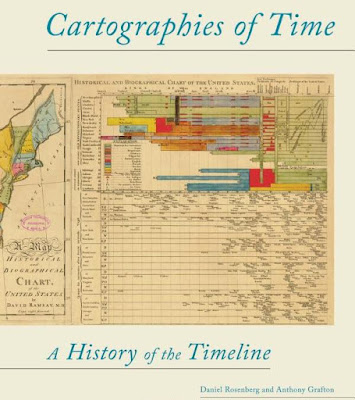
Cover of book Cartographies of Time


An important book is about to come out on the history of timelines by two key authorities in the field. The publishers say:
Cartographies of Time is the first comprehensive history of graphic representations of time in Europe and the United States from 1450 to the present. Authors Daniel Rosenberg and Anthony Grafton have crafted a lively history featuring fanciful characters and unexpected twists and turns.
See the book on the publisher’s site.

Wednesday 21 October 2009

Natural chronographics

Some natural processes produce a sort of chronographic display of their own – for example, the rings in sawn tree trunks represent the history of its growth, and geological strata represent the history of a landscape.

Tree rings can be crossdated to establish specific years in the tree’s history.
Image from Laboratory of Tree Ring Research at the University of Arizona.


Tree rings
As a page from the Laboratory of Tree Ring Research at the University of Arizona explains:
Many trees in temperate regions (those with a strong seasonal climate) produce annual growth layers that appear as rings in a cross sectional view of a tree stem. Variations in growing conditions from year-to-year produce a sequence of wide, narrow, and average ring widths. Over time the sequence forms a unique pattern that can be used like a fingerprint to determine the calendar year in which each ring was produced. [...]
Events in a tree’s life that have a recognizable impact on its growth may also be dated once the dates of the annual rings are known. Low to moderate intensity fires that burned through a forest may injure or scar surviving trees, leaving a clear record of their passage.
Strata
In at least one case the realisation that naturally occurring visual forms represent past time dawned during the same period as the early paper visualisations such as those of Barbeu-Dubourg and Priestley. This is the case with Hutton’s work on the formation of the earth.

Strata in rock caused by deposition over centuries.
Lake Bolsena, Italy. Photo: Stephen Boyd Davis.


James Hutton (1726-1797) sought to explain rock formations. His Theory of the Earth; or an Investigation of the Laws observable in the Composition, Dissolution, and Restoration of Land upon the Globe and Concerning the System of the Earth, its Duration and Stability put forward the idea that the layers to be seen where rock is exposed represent ancient depositions such as occur under water, and that places where the layers are uptilted or broken record violent subsequent upheavals.

An ironic outcome of the work in geology was to move the goalposts – at least at one end of the pitch. The beginning of time moved away to an almost ungraspable distance rather than the relatively comfortable proximity of, say, 4004BC calculated by Archbishop Ussher. The many universal chronologies and chronographies which contained all history from the beginning of all things to the present day within roughly 6000 years would become increasingly out of step with the realisation of the real extent of the past.

Event-based and time-based
These natural chronographics record time unequally: sedimentary deposit during one century may produce a thick layer of rock while that of another century ends up as only a narrow band. A year of strong growth produces a broad tree ring while one of poor growth makes a narrow one. These are effectively event-based representations. A time-based representation, on the other hand, uses what we might call Newtonian time – a regular, uniform, clock-like scale, in which events appear. 

Further reading on the Web:

Monday 5 October 2009

More on Helvicus and the arithmetic scale for time

On 1 September I noted that, while trumpeting the advantages of using equal space to represent equal time, Helvicus credited his predecessor, the renowned chronologer Scaliger, with inventing the idea.

But I was wrong.

Fooled by the translation in an English edition of 1687, I spent half a day in the British Library on a wild goose chase. I was looking at five works by Scaliger - the De Emendatione Temporum of 1583, 1598 and 1629 and the Thesaurus Temporum of 1606 and 1658 - without being able to find any of evidence of this arithmetic scale for time. I was hampered by having almost no Latin and no Greek, but still expected to identify this key aspect of the layout. I managed to find the Peloponnesian War at DCCCCXLVI (on p99) in Eusebius Chronicorum Liber Posterior within the Thesaurus Temporum but the corresponding part of the next page certainly did not contain the item of 100 years later as Helvicus had seemed to describe. Like most chronologies, Scaliger’s simply uses as much space as he needs to record and describe each event, not allocating equal space to equal time at all.

A part of the page in the English translation of Helvicus which appears to say that Scaliger preceded Helvicus in using equal space for equal time in laying out his chronologies. 
Helwig [Helvicus], Christopher. 1687. The Historical and Chronological Theatre.
From the collection of Prof Michael Twyman. Photo: Stephen Boyd Davis.

But it seems the problem is in the translation! Apparently in the first edition of his work, in Latin, in 1609, Helvicus definitely claims the credit for himself: ‘the main goal I aimed at in this treatment is an equal distribution of years between the creation and our time in intervals of 100 and 10 years, because that is so useful’ (Praecipuum, quod in hoc Systemate spectavi, est annorum a Mundo condito ad nostra tempora usque per aequalia Centenariorum et Decadum spacia distributio, ob eximium usum, qui inde resultat). The translator seems to have thought that Helvicus was crediting Scaliger and inserted the name himself – hence his use of brackets around Scaliger’s name indicating that the name as such was not in the original. My thanks to Prof. Anthony Grafton of Princeton University for unravelling this for me.

Incidentally Prof. Grafton has an important book coming out in this area next year. More on this later.

Friday 18 September 2009

Franklin

Another hand-written addition to Barbeu-Dubourg’s timeline, which adds credence to the idea that the additions were written by the original author himself, is in 1752, ‘orages demontrés electrique’ - storms shown to be electrical.

In 1750, Benjamin Franklin had published a proposal for an experiment to prove that lightning was electricity by flying a kite in a storm, and such an experiment had been carried out by others in 1752. Franklin and Barbeu-Dubourg became friends and corresponded frequently. The correspondence can be seen here. Barbeu-Dubourg translated many of Franklin’s works into French (Aldridge 1951).

Franklin was also a friend of the other pioneer of the arithmetic timeline, Joseph Priestley. In Barbeu-Dubourg’s very first letter  to Franklin, he acknowledges receiving a copy of Priestley’s own timeline, and tactfully emphasises his own priority in invention while assuring Franklin that he won’t make an issue of it:
J’ai reçu avec reconnoissance et vu avec plaisir la carte biographique de M. Priestley qui est effectivement construite presque sur les memes principes que la mienne, sans plagiat de part ni d’autre, car je ne pretens point me prevaloir de la date.

I have received with gratitude and viewed with pleasure the biographical chart of Mr. Priestley which is in truth made on almost the same principles as my own, without plagiarism on either side, as I in no way claim primacy on account of the date. 

References
Aldridge, Alfred Owen. 1951. Jacques Barbeu-Dubourg, a French disciple of Benjamin Franklin. Proceedings of the American Philosophical Society. 95(4). 331-392.

Herculaneum

In the copy of Barbeu-Dubourg’s Carte Chronographique held at Princeton, there are hand-written additions to the printed entries, four of them in the then recent past. Stephen Ferguson speculates that they were made by Barbeu-Dubourg himself (Ferguson 1991).


The discovery of Herculaneum added by hand to the Carte Chronographique of Barbeu-Dubourg at Princeton. Image: Rare Book Division, Department of Rare Books and Special Collections, Princeton University Library.


Some of them represent the emergence of significant new knowledge. The one I want to highlight here is the added entry for 1747: ‘ville de Herculane trouvée sous terre’ - the town of Herculaneum discovered underground. Herculaneum had been buried by volcanic deposits, along with Pompeii, Stabiae and Oplontis, in the eruption of Mount Vesuvius in 79 AD. Just to read the addition in its hand-written form produces a frisson of presence, sharing the excitement they must have felt when it was rediscovered. By lucky chance I was able to visit Herculaneum just a few days after being in Princeton.


 Herculaneum in 2009. The full height of buildings was encased by lava flows within hours and preserved until the 18th Century when excavation began to both reveal and destroy the remains. Photo: Stephen Boyd Davis.

Herculaneum and sites like it are special in relation to chronology and chronographics because they do not have an obvious natural visual chronology, making them quite unlike normal archaeological excavations. Normally a dig will cut down progressively through quite thin layers of material, each representing the crushed debris of a quite extended period. See Harris’ Laws of Archaeological Stratigraphy in the Wikipedia article on the Harris Matrix. A vertically cut cross-section will therefore show layers or bands in a kind of natural chronographic representing hundreds or thousands of years. But at Herculaneum the deposits many metres thick represent not years but days or even hours. The pyroclastic flow from Vesuvius swamped the town, even filling internal spaces within buildings so preventing them collapsing as more and more material fell from above. Digging up the town therefore reveals an archaeological snapshot rather than the usual extended duration.


Foreground, a well-preserved building at Herculaneum. Background, part of the excavation wall showing the solid mass of tufa deposited in hours through pyroclastic flow. Normally such depth present a succession of visual layers representing deposition over centuries. Photo: Stephen Boyd Davis.


References
Ferguson, Stephen. 1991. The 1753 Carte chronographique of Jacques Barbeu-Dubourg. Princeton University Library Chronicle (Winter 1991).

Wednesday 2 September 2009

Arithmetic scale - Blair's point of view

John Blair published a Chronology and History of the World, from the Creation to the Year of Christ 1753, which appeared in many subsequent editions and was widely used as a source, including by Priestley for his Chart of Biography of 1765.

Title page of Blair’s Chronology (1779 edition).
Collection of Stephen Boyd Davis. Photo: Stephen Boyd Davis


Blair praised Helvicus’ approach (see previous post), which used equal intervals of space for equal intervals of time, contrasting it with those whose ‘chief Aim seems to have been pointed, to the contracting History into a little Room as they could’. 
The Tables of Helvicus, which were publish’d in 1629, are what approach the nearest to the Plan of the present Work, and have been generally preferr’d by Men of Learning to all the rest; because they give a more united View of the Collateral Succession of different Kingdoms. Whereas the more Modern Tables of Talent, Marshal, Fresnoy, and those composed by an Anonymous Author from Petavius, have all of them made one great and fundamental Mistake. For their chief Aim seems to have been pointed, to the contracting History into a little Room as they could, by which they have lost the true Connection and Union of its Parts, which can never be preserved, without expanding them, according to the Series of single Years;  and we therefore venture to affirm, that this Principle is the most essential, in the Texture of a Chronological Table. For it is in Chronology as in Musick, where the Harmony does not arise, from any single Note, or from any Number of Notes, but from their properly proportioned and tuned to each other; where, without the exact Disposition of Time and Place, the true Union of Concert is broken, and the best Musick may become Discord.
Although Blair’s Chronology is a Table rather than a true Chronographic, his idea of the value of ‘a more united View of the Collateral Succession of different Kingdoms’ is important for future developments. It emphasises the idea of a visual whole in which the synchronisation of events may be directly seen.

Double page of Blair’s Chronology (1779 edition).
Collection of Stephen Boyd Davis. Photo: Stephen Boyd Davis


Detail of Blair’s Chronology (1779 edition).
The tables are engraved, rather than letterpress. Near the centre of this view is the death of Alexander Pope. 
Collection of Stephen Boyd Davis. Photo: Stephen Boyd Davis


Tuesday 1 September 2009

Arithmetic scale for time

Making a list of historic events tends to produce a dense block of information with no wasted space between items. The focus is on the events, rather than on the time that they occupy. Periods with a lot of events take a lot of space, while those with few take less. This clearly has benefits in terms of economy of materials, and means that the user need not, for instance, turn a dozen almost empty pages in order to find an isolated incident. However this ‘packed array’ approach makes it difficult to see temporal patterns in the data, such as interesting alignments, gaps and clusters.

Here is a simple example of a time list which makes no use of empty space and simply puts one event after another: BBC timeline of Nepal

A slightly more sophisticated use of time-space is to have empty rows or columns for years (or other units of time) when nothing happened. This tends to also produce the result that each page or section represents the same amount of time. This approach goes back quite a long way.
 
Title page of Helwig [Helvicus], Christopher. 1687. The Historical and Chronological Theatre.
From the collection of Prof Michael Twyman. Photo: Stephen Boyd Davis.

 
In Helvicus’ Historical and Chronological Theatre, the case is made for spacing chronology in equal intervals. But Helvicus credits his predecessor, Scaliger, one of the most famous chronologers (about whom more another time) with introducing the practice. In the introductory note Of the equal Intervals of Centenaries and Denaries, i.e. Hundreds and Tens of Years he says:
What our Author (Scaliger) chiefly aim’d at, in his first contrivance of this Systeme, was a distribution of Years, from the beginning of the World down to our own times, into equal spaces or distances of Centenaries of Decads (viz. Hundreds and Tens of years) by reason of the singular use or advantage which therefrom result. For thus, the Reader cannot chuse but remember and declare, by the year of the World, or of Christ, wherein every Exploit or History happen’d, how many years the one was from the other; provided he make himself well acquainted with the Order and Continuation of the principal Governments of each Monarchy, by which guidance the Series of History will easily be retain’d in Memory. For every Page of his did contain one Hundred entire years; so it must on necessity fall out, that the correspondent Number of the next Page over against it should differ therefrom a Centenary of years. As for Example: the Peloponnesian War (which happened in the year of the World 3519) was placed in the end of the second Cell, (Area) or Denary: Opposite thereto, in the same part of the  following Page, was set down the Battel at Arbela, wherein Darius was subdued, and the Power was invested in Alexander; whence it appear’d, that there was the space of One Hundred years between the beginning of the Peloponnesian War, and the time wherein the Grecian Monarchy began.
So he is arguing that this design produces benefits in terms of:
  1. remembering sequences, including how long events lasted (the Order and Continuation of the principal Gorvernments); 
  2. the estimation of intervals between events.

Monday 31 August 2009

The First Modern Timeline?

Joseph Priestley's Chart of Biography was not the first modern timeline to be published.

In 1753 appeared the first – the only – chronographic publication of Frenchman Jacques Barbeu Du Bourg. By gluing multiple sheets of paper together edge to edge, he produced a continuous engraved chart 16.5 metres (54 feet) long. This originally cost 12 livres. Princeton University library has a rare, perhaps unique, superior version of the chart, which is mounted on rollers in a wood and papier mache case and can be scrolled back and forth, allowing the user to see all of history since the beginning of time down to 1760. This cost 15 or 18 livres - presumably there was a standard and a de luxe case.

Barbeu Du Bourg was not alone at that time in envying the visual appeal of Geography, which was contrasted with the dryness of dates and names in chronology. In proposing his Carte Chronographique, he wrote:
Geography has as its object the extent of the earth; Chronology has as its object the succession of time. May not duration be imitated and represented as effectively to the senses, as distinctly as space, and may not intervals of time be as easily counted in degrees? What impediment is there: it is quite as easy to measure years as to measure places, in fact simpler and more easily done in several respects.
Chronographie, ou, Description des tems. Paris : Barbeu Dubourg, Lamote, Fleury, 1753. My translation.
A digitised rather rough photocopy of the descriptive booklet can be found here (PDF file, 1.3MB).

A good article on this timeline, written by Stephen Ferguson, Curator of Rare Books at Princeton, is here (PDF file, 4MB).

A high resolution image of the case containing the timeline is here (JPG file, 13.5MB).

Images: Rare Book Division, Department of Rare Books and Special Collections, Princeton University Library. Full versions of these images can be found under the entry for Call No. D11 .B37 1753 on the Princeton library site here.

Chronographics

Chronographics is defined here as the visual representation of time. I will be concentrating on historic time, rather than, say, time in project planning, time in media construction (such as for movies), or time-recording in scientific experiments.

Chronologies, various ways of listing events in time order, have existed since history was recorded. In fact arguably the first histories were chronologies only, offering no other information than dates and events. In some senses even these lists, when written down, were a form of chronographics, but I will be using the term to refer to visual structures which place more emphasis on the graphic properties of space, and less on the raw content.

One of the commonest forms of chronographic design is the timeline. This word has been widely used recently to mean any form of chronology, but I shall only use it to refer to graphics where the duration of events is represented by lengths of lines.

One of the earliest examples of such a timeline was created by Joseph Priestley (wikipedia article) in 1765.

 
Detail of Priestley's Chart of Biography 1765.
Original at Chetham's Library, Manchester, UK. Used with permission.